The number of Internet users,especially mobile devices users surge, which pushes many web designers to find a way to make the web sites look good on all devices. Mobile devices often display size will be limited, and therefore need different ways content presented on the screen.
Responsive Web design is the approach that suggests that design and development should respond to the user's behavior and environment based on screen size, platform and orientation. The practice consists of a mix of flexible grids and layouts, images and an intelligent use of CSS media queries. As the user switches from their laptop to iPad, the website should automatically switch to accommodate for resolution, image size and scripting abilities. In other words, the website should have the technology to automatically respond to the user’s preferences. This would eliminate the need for a different design and development phase for each new gadget on the market.

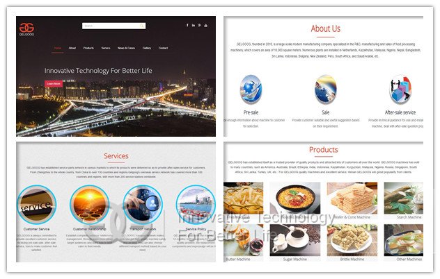
Gelgoog has update our new version website for the last two weeks. The new version of
gelgoog.com looks good on all devices((desktops, tablets, and phones). Everything looks flexible, the layout, images, contents. A full-sized design, unless specified otherwise, would just shrink proportionally for the tiny browser, with no need for scrolling or a mobile version. Then, the user could easily zoom in and out as necessary.
After publishing new version of gelgoog.com, the users can easily visit our website on any devices. There's no doubt that responsive design is more complex than a traditional desktop website. However, having one responsive website requires a lot less work than having two separate websites. This not only saves time and money in the original design stage, but it also will make life a lot easier on your development team. When we make a change to our website, it's all done in one place. Home page is a full screen, which shows the primary navigation, like About, Products, Service, Contact, etc. While when you click each block below, you will be access to the second nacigation for details.

 Your Position:
  The number of Internet users,especially mobile devices users surge, which pushes many web designers to find a way to make the web sites look good on all devices. Mobile devices often display size will be limited, and therefore need different ways content presented on the screen.

 E-Mailggjx@gelgoog.com
 Contact0086-18537181190
 Whatsapp0086-18537181190
 TOP
TOP